Bonsai Logo Trend Predictions For 2016

It’s the beginning of another year, and we’ve been thinking about the ways the design world has continued to adapt and change over the last twelve months.

Our viewing habits continue to shift from desktop to handheld devices and we’re increasingly viewing information in a setting full of distractions and time-limits. Iconography is playing a bigger role in carrying information in a digital space and we’re depending on icons like the ‘heart’, ‘thumb’ and ‘smiley face’ to communicate our emotions and thoughts in online conversations. Our ‘modern-day hyroglifics’ cut through the small talk to provide instant communication in a time where attention spans are short. Why shouldn’t logos have the same effect?

We reckon a company’s logo is just as, if not more important than its name. A good logo will communicate a company’s identity, relevance and understanding of its use and functionality. We want a brand’s logo to tell us an intriguing story that will cut through the distractions and instantly communicate what needs to be said.

So, in this time where consumer habits are ever changing, what are Bonsai’s predictions for the logo trends of 2016?

1. WORDMARKS

This talk about icons taking over the written word is just the beginning of a very complex debate. What we’ve noticed is a shift towards wordmarks cleverly combining icon elements with text to become the logo itself. Using a wordmark is effective in promoting brand name recollection and playfully displaying what the company does. A good wordmark can truly make a business name speak a thousand words.


logo example1-logo design noosalogo example2-logo design noosa

2. AUTHENTICITY

‘Homestyle’, ‘Family-owned’, ‘Natural’, ‘Local’ and ‘Rustic’ are words that are increasingly used to make a business or product seem more real or personable. Giving logos a handmade aesthetic is an effective way to appeal to its audience’s desire to be part of something tangible, human and authentic. We predict that businesses will continue to move away from heavily corporate branding, in an attempt to deliver an intimate and relatable experience to the modern customer.

logo example4-logo design noosalogo example3-logo design noosa

3. FLAT DESIGNS

The flat logo is the logical response to mobile devices increasingly dominating how we access content. They are versatile, device-friendly and offer a no-frill modern minimalism. Flat designs also make use of bold, statement colours that stand out on screens. We predict more 2016 logos will opt out of shading and texture, instead embracing the statement boldness and functionality of flat colours.

logo example6-logo design noosalogo example5-logo design noosa

4. COLOUR CONTRAST

One of the great things about viewing graphics on a screen is the way colours can appear more vibrant, especially when it comes to contrasting colours. This effect works wonders with minimalistic logos, drawing attention to certain design aspects and offering a chic minimalism.

logo example8-logo design noosalogo example7-logo design noosa

So there you have it – our logo trend predictions for 2016! Remember; whether you’re a new business or you’re looking to freshen up your company’s image, a new logo can work wonders. At Bonsai we’re committed to delivering fantastic logos to make your business stand. Contact us for a quote today!

Logo trends for 2015

With 2015 well underway, the team here at Bonsai Media thought it was about time to share with you all what we believe the next 12 months will hold for logo design, highlighting some of the trends and tendencies we expect to see over the coming year. Some of these trends are based on what we’ve seen since the beginning of the new year, some are natural continuations of where logo design was at last year and some are educated guesses and perhaps even a little a bit of optimistic thinking. So have a read, we hope you find them useful.

1. Corporates are still playing it safe

A quick look at the big logo releases this year and one thing becomes obvious pretty quickly: big corporate companies are still playing it very safe with their branding. For example, in January alone, the new Smith Optics logo, the revised LG logo, the new Transunion and the new Singtel logo (just to name a few) have all stayed with a tried-and-tested approach. And while all of these logos are nicely designed, cautious design can be a good thing or a bad thing. Being safe means your brand won’t alienate any parts of your potential market, but it also means you might not connect with them either; many companies that use very safe design when creating a logo miss an opportunity to tell their customers about what they stand for.

2. Pure type is back

Of good news to all great designers is a return to popularity of the pure type logo. Featuring nothing but a beautiful typeface cleverly laid out (usually highly-personalised), pure type logos can fall in the playing-it-safe category, but they don’t have to. When they are well done this style of logo is almost unbeatable, and the good news for business owners is that they almost never date. So that’s where the smart money is this year.

3. Flat Design is big

Interestingly, for the first time this year, we expect to see more print design that has been influenced by digital than digital design that has been influenced by print. The most obvious example of this is the flat design that has been so popular since the release of IOS 7, and given its minimalist approach it has resulted in some beautifully simple logo designs. With it’s neat, iconic and stripped back look, flat design isn’t exactly new, but it is definitely having a well-deserved resurgence.

It’s interesting to note that sub trends are emerging here, as designers adopt this general approach but look to ways to differentiate it. One that we’ve noted is a mock screen-printed appearance, that we really like, with interesting overlapping colours. We have also seen several logos containing simple Asian-influenced cartoon graphics, with fun rounded type, kitsch child-like characters (think Hello Kitty or Kerrope Frog) and bright pastels. And while these delightfully naïve logos might not be suitable for all businesses – banking, real estate and public libraries for example – they really are great fun.

4. Designers are hipsters

It will probably come as no surprise to most of us, but there are one or two designers out there who could be considered slightly hipster, and their work is no different. The continued ‘hipsterifacation’ of logo design will see a pastiche of vintage elements (such as forties-style monograms and eighties fonts) and tongue-in-cheek humour in logos. And while the best of this breed of logos will be thoughtful, whimsical and give a sense of intimacy to the viewer, the worst will date very quickly. So definitely watch out for any logos that contain a moustache, top hat or a monocle motif (unless you’re setting up an online gentlemen’s outfitters…).

5. A special mention

While this final point isn’t a trend as such, we thought the new logo for wireless sound tech company Sonos deserved a mention. The logo features a simple but well crafted logotype with a series of colourful spoke-like beams radiating from its centre. But here’s the real stroke of genius: when seen online, if the viewer scrolls either up or down past the logo, a simple optical illusion gives the impression that sound waves are actually emitting from the logotype, just like the products that Sonos actually sell. Brilliant, thoughtful design at it’s best.

So there you have it, the Bonsai Media logo design predictions for 2015. That being said, to our mind, it’s better to buck trends than to follow them. So if your company or project is looking for a beautifully designed logo that stands out, and you’re looking for designers in the know, contact Bonsai Media. As well as having a first rate design team that specialise in logos and branding, we work on clients all over Australia from our office in Melbourne and our smaller team in Brisbane. We’d love to hear from you.

how much does an ecommerce site cost?

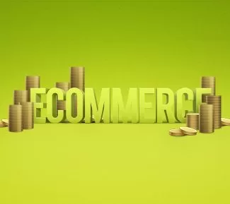
With online sales tipped to hit $370 billion by 2017, it’s not surprising that these days, everyone wants a slice of the ecommerce pie: not only is it big bucks, it’s cost effective, it is light on human resources, and a good online shop exponentially widens the reach of your business. But without a good quality, well-designed ecommerce site, your business doesn’t stand a chance. That’s why the team here at Bonsai Media thought we would put together a bite-sized discussion of ecommerce for anyone thinking of getting into the business.

So the obvious starting question is ‘How much does an ecommerce site cost?’
Well unfortunately this is difficult question to answer without knowing the specific ins and outs of your business and the ecommerce website design you need. Obviously we’d love to hear from you (you can contact us here) to help give you a more tailored answer, but in the meantime, there are a few things you should be aware of. With ecommerce you get what you pay for. The bad news is (if you’re not savvy) it can be easy to blow your budget. But the good news is, you really only need an expensive ecommerce site if you’re a big player: a company like Amazon will obviously have very different needs than (for example) a Melbourne-based baby store.

There are three main factors that influence cost that you should consider. Firstly, the size of your customer base: this defines the different technologies needed to keep up with your web traffic. Secondly, the various features and functionality you require for your website; this may change dramatically depending on the nature of your website and what you want to offer. It is important here that before choosing a team of developers that you find out if they will allow you to pick and choose the functions you need – this can not only limit your costs significantly, it allows you to tailor your solution to your customers’ needs. And thirdly, whether you choose a site made from off-the-shelf components or a totally custom built site: again, this can have a big impact on your budget.

So by now you have a pretty good idea of what you’ll be paying for, so the next question usually is ‘Can I get something cheaper that’s still usable?’
Well the good news is that you can, as long as you’re sensible. The benefit of using a company like Bonsai Media is that with a bit of thought and guidance into what functions your ecommerce site needs, you can start off with a fairly basic package (that is obviously still very usable and looks great) and develop it as your business grows, adding functionality, and upgrading elements as your business needs change.

When you are setting up your site, it’s a sensible idea to put some of your initial budget aside for marketing – i.e. to actually get people to your website so it can start earning you money. Marketing, both online and offline, can make or break a new digital business, so it pays to spend a bit of time thinking about it, or talk to a few experts on your best plan of attack (we’d be happy to help, and can be contacted here). One of the services we offer that we find is particularly cost-effective for entry level clients is the use of Google Adwords. Adwords are the text ads you see on Google after you’ve searched for a series of key words. They are an incredibly efficient way to get your messaging in front of potential customers, and the good thing is, they are incredibly targeted, working off whatever key words a Google user has searched for.

And finally, what can I expect to pay to keep my ecommerce site going?
In the wild world of ecommerce, many new comers seem surprised they can’t just set up their website and leave it, so before you start the building process, it’s a good idea to be aware of what ongoing costs may come up. Like building your site, these costs will vary depending on the size and functionality of your system, but can include software licensing, hosting, security maintenance, updating your content for new or changed products and of course, marketing. But there’s more good news, because (unlike many other companies) Bonsai Media has no ongoing fees; once your site is set up, there’s no extra costs to you.

So to summarise…
In the end it comes down to common sense and gut instinct. Think out what you need before you start the process, go with a designer you trust and choose someone who’s charging an appropriate amount – if it’s too expensive you’re being taken for a ride, but if it’s too cheap you’re just throwing your money away. As we said, it’s hard for us to be more specific and give you an approximate figure here, but we’re always happy to help. So if you would like to get a better idea of what your ecommerce site design and development could cost you, contact us at Bonsai Media; we do great ecommerce solutions for small to medium business (as well as a range of related services) from our offices in Melbourne, but we also service Brisbane and we’re happy to work with companies Australia-wide.

So what’s all this about responsive websites?

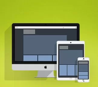
Unsurprisingly, responsive design is exactly what it sounds like: a branch of web design that recognises and responds to the specifications (such as size) of the computer, tablet or smart phone on which it is being viewed so that it’s always seen at an optimal state.

The need for responsive design has been there for a long time, as consumers interact with web sites through different browsers and screen sizes. However, recently this need has snowballed as the number of web-enabled devices, such as smart phones and tablets has multiplied. This means the approach we take towards design has to evolve. No longer can designers make assumptions on how their site will be viewed.

In a nutshell, a website that employs responsive design finds out what device is being used to view the site and changes elements of the design. This can mean making the text bigger for smart phones so it is easier to read, changing the style of the buttons to make it more intuitive for a touch-screen user, changing the resolution of images to keep access snappy and even showing different content; basically responsive design is only limited to the skills of your designer and the needs of your business.

One of the key principles here is designing sites that are divided into ‘sections’ that reorganise depending on the browser’s width. While technically this isn’t too difficult, creatively it requires a designer who has put a lot of thought into how the elements of a design should stretch or shrink. Your designer must have answers to these questions: How does the layout react? How do we restructure our content? And what images should crop and what images should be resized? When you consider the hundreds of different browsers, screen resolutions and device sizes in the market, these questions become impossible to answer without a thorough understanding of web design.

For both clients and designers there are huge benefits to responsive design, but the most importantly is that it allows businesses to have one ‘all-powerful’ website that works on any device. For clients this means they don’t need to spend big money creating a traditional site and a mobile site (which probably will only look great on either an Apple product or a Android system but not both). It also takes the guesswork out of future-proofing their website – no one knows for sure what new technologies will be around in two or three years, but the point of responsive design is that it will easily assimilate into new media.

For designers and developers, on the other hand, it means we can spend our time getting the original design perfect, developing a site that fulfills the needs of our clients. It also means we can offer our clients a cost-effective and highly flexible solution for their communication needs, which is what we’re all about at Bonsai Media. So if you’re looking to increase the range of your web offering, contact us here at Bonsai Media; we’d love to help you out.

Colour Trends 2014

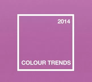
Every season brings with it a swag of new colour schemes that capture the imagination of both the design world and their consumers. This year will be no exception with new colour pairings and rediscovered classics through print design, website design, logo design and even fashion or interior design.

Well we should start off with the official Colour of the Year from the unquestioned kings of colour – Pantone. And for 2014 they’ve chosen ‘radiant orchid’ – a soft but rich purple. This particular shade isn’t just popular with graphic designers though – it’s also been earmarked by fashionistas, with Vogue Magazine picking a similar shade of purple as one of the colours they expect to emerge this year.

As colour pairing goes, this year will see a lot of combos that have traditionally been frowned upon. Where as in the past a bright colour would often be teamed up with either a subtle colour or a dark, subdued colour, these days the rulebook has been rewritten. So expect to see bright colours teamed up with other bright colours, such as red and purple together. As part of this, we expect to see a continuation of last year’s interest in fluro oranges and yellows.

One of the key colour schemes that has emerged recently teams up bright earth tones, such as a strong orange or yellow, with cool pastels, such as light blue, bright green, a subtle aquamarine or even a washed-out purple. This look feels like it has a bit of a Mexican inspiration, and as such the strong contrast in colours here works really well in geometric and tribal patterns.

A movement that seems likely to continue into the new year is the prominence of designs that feature a white background with a multicoloured device over it, often anchored by black elements. While this approach can look amazing and can look very fresh and fun, it needs to be crafted by a talented designer to ensure it works. While simple one or two colour schemes allow huge flexibility as the design ages, multicoloured designs can be quite limited, especially as photography styles change and evolve.

On the other end of the spectrum, and to finish on a simple note – black and white could well be the next big thing (again), but this time with any shades of grey totally striped out. By itself, the pure simplicity of the combo is virtually unbeatable and as part of a design, it’s neither overpowering nor weak, and works beautifully with both full colour photography. In many ways, the versatility of black and white actually comes from it’s lack of meaning: it becomes all about the shape of the design, which is unladen by colours and what they imply.

So as you can probably see, at Bonsai Media we’re pretty passionate about colours. Why? Because it’s such an important facet of good design, and we are all about good design. And while we love to know what’s happening in the world of design, be it colour, typography or iconography, with all honesty we don’t really design by what’s in fashion at the moment; we think our clients deserve something with a little more longevity than that. So regardless of what colour scheme suits you, be it black or white, multicolour, something in between or something totally new, if you think your business could benefit from a design team that is passionate about helping their clients, then contact us at Bonsai Media, we’d love to hear from you.

Design Trends 2014

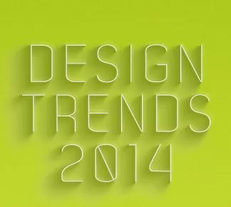
This year, our designers agree, it all boils down to one overarching movement – refinement and simplicity.

Simplicity will be king this year. After the heavy use of textures, gradients and mulit-colours though out 2013, we believe the way forward is going to see a lot of logos stripped back to their most basic elements. In many ways, this is where great logo design steps forward: as the design is refined and reduced to nothing but it’s most important parts, there are no bells and whistles to distract the viewer, only perfectly crafted typography and beautifully simple iconography. A simple logo needs to work harder.

Part of this move towards simplicity will see more logos paired back from multiple typesets to a single font. Over the last year a number of logos have relied on several display fonts; the benefit of this is that each typeset adds to the overall communication. However, with only one font, the designer needs to have the knowledge of type to nail the font choice. They also need to be brave enough to stick with their choice, crafting and finessing the type where necessary.

Another trend we foresee emerging as designers re-fall in love with simplicity is that more and more brands will adopt a logo that uses negative space in it’s design. When it’s well done, negative space is stylish and clever, and suggests a company that is prepared to approach problems from a different angle. When it’s done simply but effectively, negative space is almost unbeatable.

Putting simplicity aside for the time being, we’re predicting a couple of minor trends for the next twelve months. 2013 was the year of circular logos housing a loopy script font logotype. Especially popular with brands aiming at a young hipster audience, they looked great at the time, but it’s time to move on. Besides that, AirAsia nailed the look years ago (sorry Grill’d). Another trend we foresee coming to life is this: recently we’ve seen a couple of great logos that incorporate simple Escher-style impossible shapes. Expect to see a lot more of these over the next twelve months.

When it comes down to it though, this is all guess work, even if it is educated guesswork. The only real way to know what is going to be great in logo design in 2014 is to be part of the process. That’s why, at Bonsai Design, we’d love to help your company redesign your website that sets your business apart as well as standing the test of time.

Design Trends 2013

Here’s a look back at trends that have influenced logo design over the last twelve months.

These trends have a range of different impetus. Some come from technical or cultural changes in the industry, others can be seen as the aesthetic zeitgeist of the moment. With some of these trends, it’s important to consider why they’ve come about and give them fair consideration during the design process: when the principles behind these trends build on the knowledge pool of the design community rather than just capturing the style of the moment it makes sense to pay attention. But with others, the value in identifying these trends is so that we can avoid them – otherwise your logo will look dated in the pretty near future..

Trend 1: Everything’s multi-coloured.
First off, one of the big trends last year was a spectrum approach to colour schemes (as can be seen in the new Motorola, Mall of America and SkyForex branding). This multi-coloured approach is great (disclaimer: when used well) and can be an easy visual to suggest a company’s multicultural credentials in a visually pleasing way.

Trend 2: We’re here.
Those ‘Google Maps upside-down-teardrop’ icons have been everywhere over the last year, some used well – take the Photofound logo for example – others not so well. But either way, if you want a logo design that needs a life span longer than a year and a half, there are better ways to find it than looking on a map.

Trend 3: Good design makes everyone happy.
The widespread use of mobile phone apps has had a interesting effect on logo design. As designers get used to designing icons in a style that’s consistent with the App Store look and feel, they’ve taken elements of this style and incorporated it into logo design – a wider but related field. One of the key things here is size – while every designer thinks their designs are perfectly legible on a tiny scale, only the best logos actually are (see some great examples here). Basically, the App Store’s tiny icons have forced designers to think small while thinking big.

Trend 4: Our little logo’s all grown up.
The last year has seen many of the bigger companies ‘mature’ their brand. The most obvious example of this is Ebay, who’ve evolved their original logotype, ditching the ‘whacky’ letter heights but keeping the iconic colours. Other tech companies have taken a similar approach, with Google finessing its wordmark and losing the drop shadow, and Yahoo adopting a single colour approach. Generally this makes sense (depending on the product, obviously) as a ‘zany’ logos don’t necessarily instill confidence in consumers.

Trend 5: Designers obviously drink craft beer.
It might sound like a bit of a joke, but if you look at a lot of branding work, it’s easy to assume that when the designer was thinking about style they had recently been looking at a craft beer label, with quirky lettering, several fonts, washed-out colours and lots of texture. It has led to a lot of beautifully crafted logos and style guides, but beware, the faux-handmade style could look very dated very soon.

So that’s basically the main design trends we’ve identified, though obviously there’s been many more over the last twelve months. So if you can think of any or if you’re interested in talking logos with any of our designers (believe me, they’re always keen), and you’re in Noosa or anywhere else in Australia, just drop us a line here.

Logo design goes for gold (but finishes last).

When the Port Macquarie News did an article on local hero James Magnussen, one of their graphic designers wanted to use the distinctive London 2012 logo on their front page, so they apparently did a quick internet search for the logo.

Unfortunately, someone out there had done a bit of social commentary to show what they thought of the new Olympic logo design, and the logo used on Port Mac masthead was a fake…

olympic_logo_newspaper-768x250

Hat’s off to the maker of the fake logo, we think you did a better job than the designers of the real London 2012 logo.

It just goes to show if you’re looking for a good logo, particularly in Brisbane or Melbourne, there’s only one place to go: Bonsai Media.

eCommerce website trends

In the ever-changing world of ecommerce, it’s important to continually evaluate your online offering so you remain relevant to your customers. Part of that means staying ahead of the latest trends. So to help you do just that, your friends at Bonsai Media have put together a 5 minute overview of this year’s main ecommerce trends (we call it the Bonsai Media 5 Minute Overview of this Year’s Main Ecommerce Trends).

1. Social media could be your new best friend: A recommendation from a friend or a relevant ‘brand community’ has a bigger impact with customers than traditional advertising. On top of this, it also leads customers directly back to your online shop. (A great example of this is Brisbane’s Blackmilk. This clothes company was one of 2012’s runaway successes, and while they keep their website designer pretty busy, almost their entire marketing budget is actually spent keeping their Facebook page interesting.)

2. Ecommerce is mobile: smart phones are the new window shopping, so if your ecommerce website design can convert those browsers into shoppers, you’re laughing.

3. Do CRM well and you’re destined for success: online customer relationship management is nothing new, but online customer loyalty is. So it figures that companies that learn to do CRM well will sell more to their existing customers and get more repeat customers, and that equals success.

4. It keeps getting bigger: the ‘e-economy’ keeps growing and it doesn’t look like it’s going to stop any time soon.

And that means if you’re going to do well in the ecommerce environment, you need the right tools. Bonsai Media can help you out with everything you need; with a presence in both Melbourne and Brisbane, our ecommerce web designers can help with anything from getting your company online, developing your online shop front or re-evaluating your ecommerce web strategies.

NAB’s Online Retail Sales Index has been released

The NAB’s Online Retail Sales Index was released last week and had some very interesting points for anyone with an interest in ecommerce and online stores (or just making a decent profit on the net).

One of the main findings of the report (though I’m sure this isn’t news to any one who’s up on ecommerce), is that online spending in Australia is still going gangbusters – up to a whopping $14.1 billion last financial year. That’s a total of 6.3% of the nation’s overall retail sales. Given that the year started off very slowly, it’s an easy assumption to make that next year’s outlook is set to jump significantly again. And if the year-in-year-out trends maintain their trajectory, online spending will just keep growing.

Across the country it was all good news for online retailers, with the population of NSW spending the highest amount, closely followed by those from the Melbourne/Victoria catchment area – who accounted for 23.4% of the nation’s online spend, and then those from the Brisbane/Queensland area, accounting for just under a fifth of the nation’s spend.

The big winners from the report were retailers with a bricks and mortar store backed up by an ecommerce offering – these guys stole a slice of the market away from those store’s with a purely online presence. Which backs up our theory that if you’re a bricks and mortar store without a online store, you’re losing out on potential customers. The two seem to support each other perfectly.

Another interesting point was that goods sold by Australian-based retailers accounted for 73% of our national spend. That seems to us as a pretty good indicator that for Australian businesses there’s still a very big profit margin to be accessed through establishing a well thought-out, well designed ecommerce website.

So if you’re looking to develop an ecommerce platform for your business or you want to get the most out of your digital strategy, contact us at Bonsai Media – we know ecommerce through and through, we’ve got some great ecommerce designers and we’ve got a presence in both Melbourne and Brisbane.

IT logos that need some change

If there’s an industry that lays claim to some of the most boring and badly designed logos around, it’s got to be IT. For some reason, they all seem to be pretty much the same (how many IT logo designs have you seen that make the on-button symbol from the ‘O’?).

And at Bonsai Media, we can’t really work out why that is.

The way we see it, the nature of IT opens up a huge range of logo design potentials. Stylised interpretations of the various hardwares and technology used, for example. And as an industry, the overriding themes it deals with, such as leadership, new thinking and ordered thinking are the stuff dream-logo-design briefs are made of. We saw a great logo the other day that used a really simple typographic treatment to show connectivity with pure genius.

The obvious explanation is that the IT industry is ‘conservative’ – but that seems based on pretty out-dated stereotypes. Most of the time the work IT companies are doing is anything but dull. In many cases, Information Technology is as much part of the creative industries as design, web development or advertising. You only need look at the people who make up the new IT industry to see that. These days your average IT geek is switched on, passionate, interested and interesting (they’re now fluent in English, not just in code).

It just doesn’t make sense for IT companies to continually accept poor quality work from their design company (we reckon companies should only accept below-par work if they themselves churn out below-par work). So if you’re looking for an interesting, well-designed logo or branding for your IT company or consultants, and your designers keep delivering boring work, maybe it’s time you spoke to Bonsai Media?